Parsing the patterns in student success
by Mark Largent, vice provost & dean, Undergraduate Education
 Every once in a while, we find something in MSU’s data that leads us to a new initiative or instigates a major policy change. In 2017 we discovered interesting patterns related to the number of credits students enrolled in during their first semesters and overall student success. After significant analysis, we concluded that students who earned 30 or more credits in their first year at MSU persisted and graduated at higher rates than nearly identical students who “took it easy” their first year and completed less than 30 credits. These findings led to the Go Green, Go 15 credit momentum campaign. Combined with the introduction of flat rate tuition in 2019, this campaign led to increases in graduation rates and decreases in our students’ average time-to-degree. One the whole, MSU students are now graduating a full semester earlier than they were in 2015.
Earlier this week, we stumbled across another interesting pattern in some of our data. We have not yet done the deeper analysis necessary to say conclusively what this pattern means, but because I find it so interesting, I wanted to share it while we continue to investigate.
Plotting the pathway
When you plot the graduation rates and the acceptance rates of colleges and universities, you create a scatter plot that demonstrates a long-recognized pattern: more selective (less accessible) institutions have higher graduation rates, and less selective (more accessible) institutions have lower graduation rates.
The generally understood explanation for this is schools that have the reputation, or the financial ability, to accept only students whose preparations best align with the schools’ offerings can craft incoming classes of students who are likely to graduate. Conversely, schools that lack the reputation, or funding, to be highly selective must be more accessible, and thus admit students with a wider range of needs and likelihoods of graduating.
Barrett Taylor and MSU’s own Brendan Cantwell explored the selectivity/success dichotomy in their 2019 book, “Unequal Higher Education: Wealth, Status, and Student Opportunity.” They argued that institutions’ competition for resources and social status, along with reductions in state funding and other cultural and political factors, has created “increased inequality among colleges and universities in the United States” that “systematically disadvantages underserved students.” It is a perfect recipe for a rich-get-richer and poor-get-poorer system; it drives institutions to use the admissions process to admit students who are best prepared to graduate from their schools, rather than motivating institutions to be better at graduating the students they admit.
Taylor’s and Cantwell’s book had a significant impact on me and many of my colleagues. It has motivated us to improve our institutions’ ability to simultaneously be more accessible and more successful at supporting students to persist and graduate. MSU’s 2030 Strategic Plan calls for us to do exactly that.
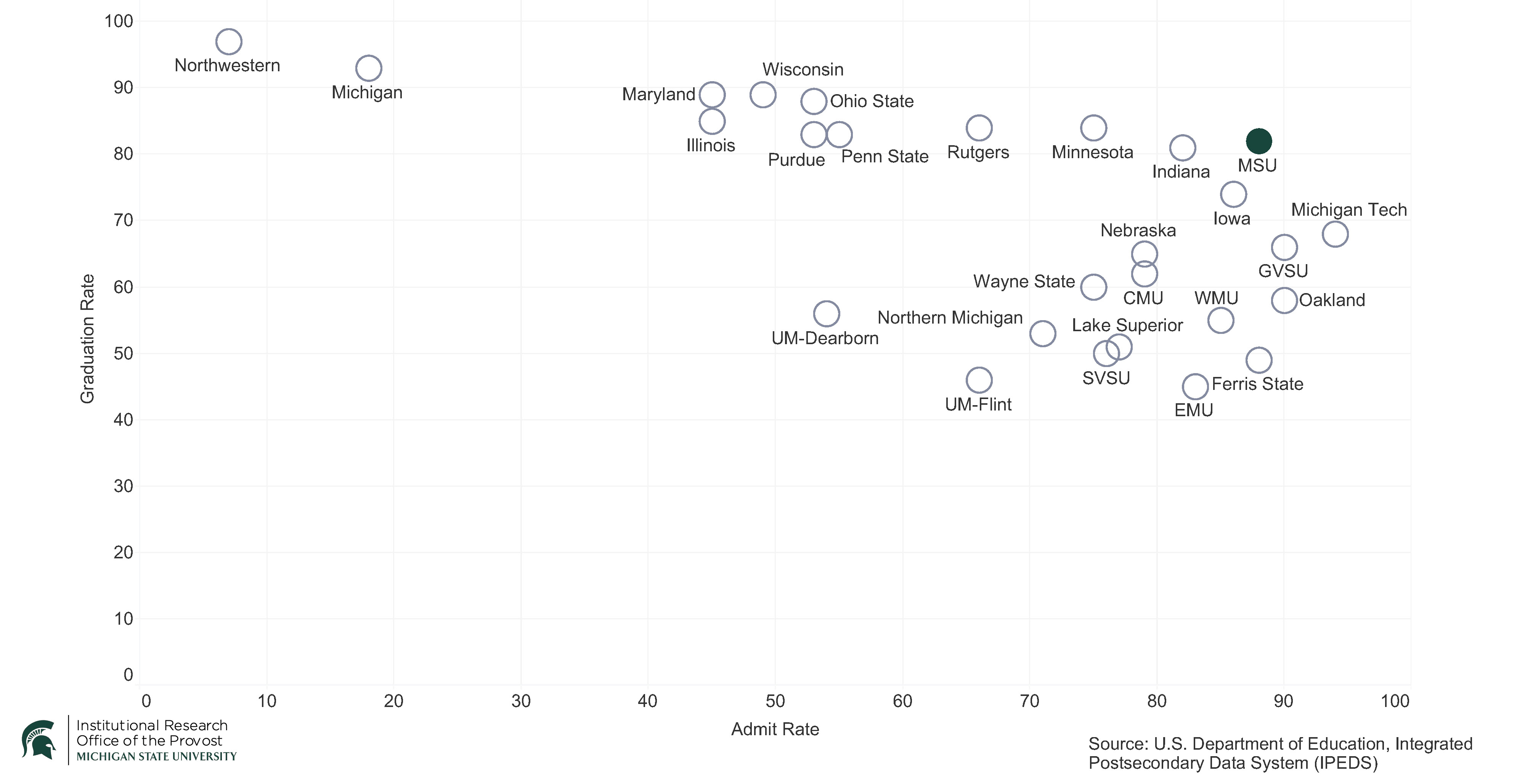
Last week, I asked my colleagues in MSU’s Institutional Research to create a scatter plot of Big 10 and Michigan public institutions’ acceptance and graduation rates in 2015 and in 2023.
Using the U.S. Department of Education’s Integrated Postsecondary Education Data System (IPEDS), Jacqui Broughton created a set of charts that showed, among other things, that MSU has been very successful in becoming more accessible and more successful at graduating students over the last eight years (see chart 1). In fact, no Big 10 school and no public school in the state of Michigan is both more accessible and has a higher graduation rate.
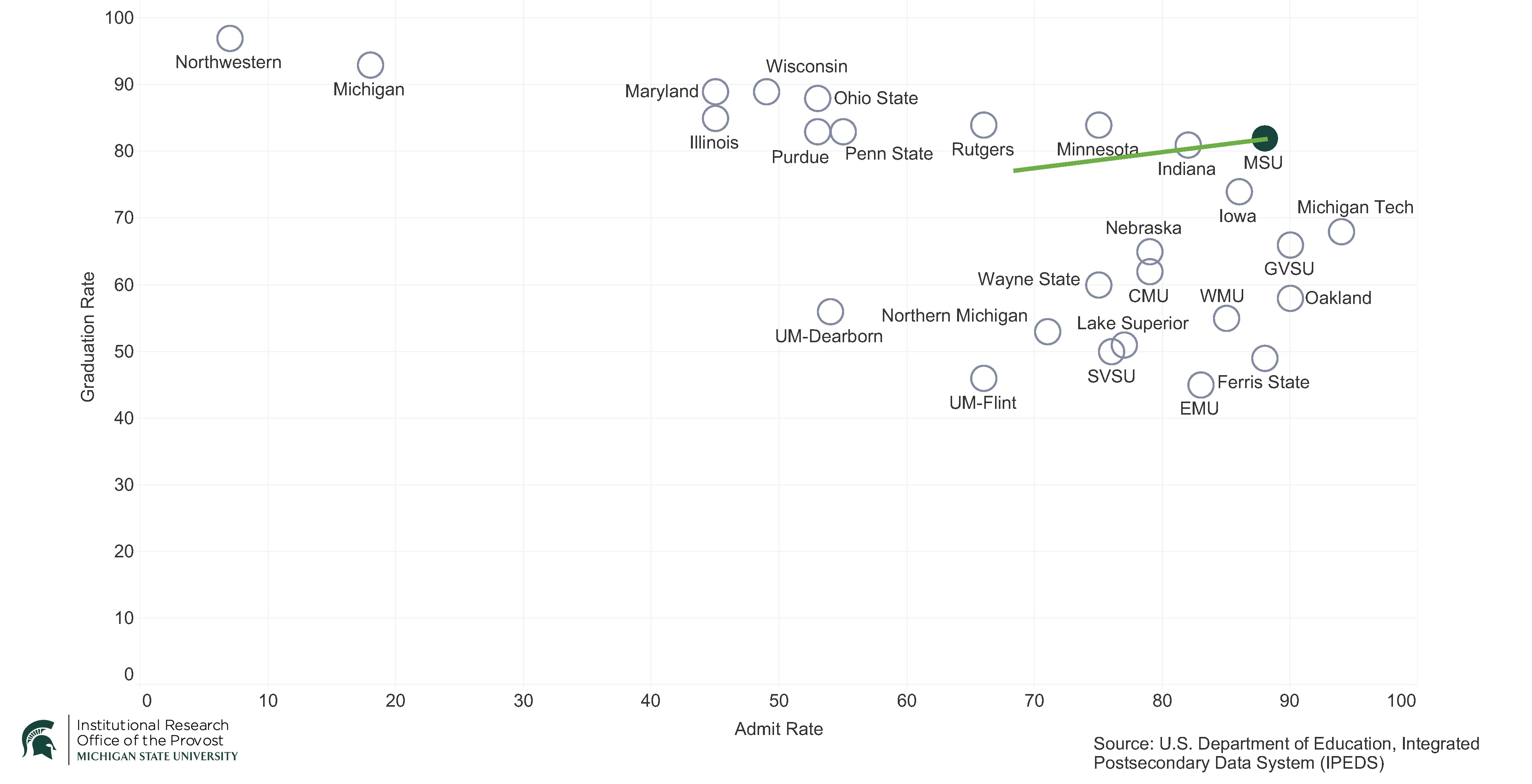
Chart 2: 6-Year Graduation Rate by Admit Rate (Big10/Michigan Public, 2022), with MSU 8-year progress line.
To demonstrate the progress MSU has made, I put a line on the chart showing where we were eight years ago (see chart 2). It nicely displays the progress we have made in pushing into the upper right-hand quadrant of the chart.
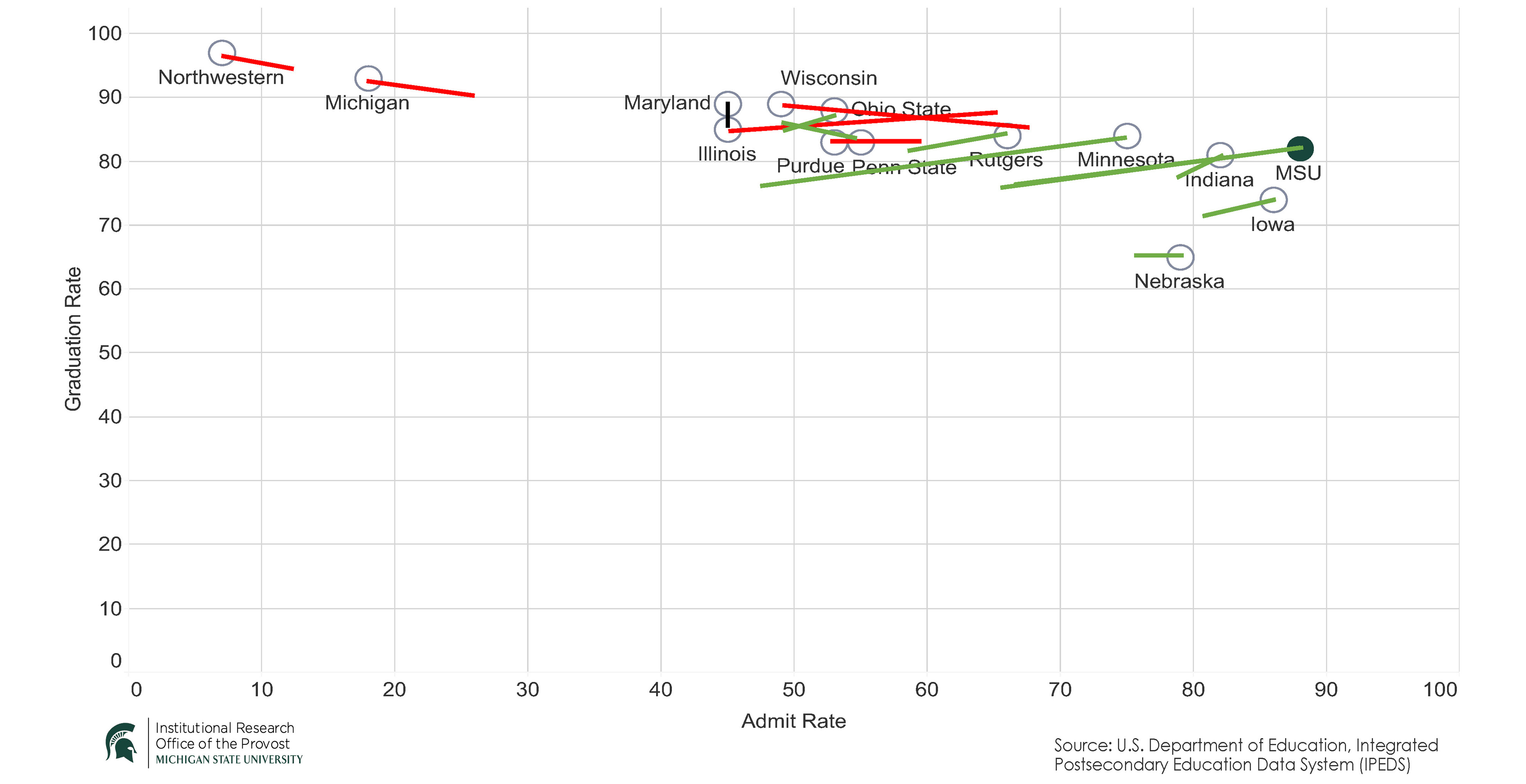
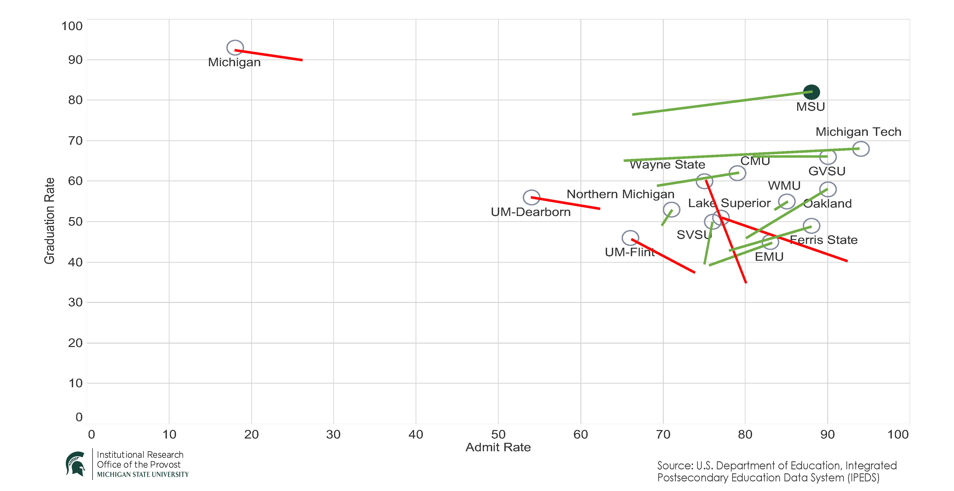
When I charted every school’s changes over the last eight years, the
exciting new pattern emerged. Because it gets very busy, very quickly, I split apart the Big 10 schools from the Michigan public schools. I also color-coded the lines to distinguish those schools that grew more selective (red) from the schools that grew more accessible (green). Have a look (see charts 3 and 4).
Deciphering the data
The pattern among Big 10 schools is striking, and a similar but more complicated pattern exists among Michigan public schools.
First, every school has increased their graduation rates, except the University of Nebraska, which stayed the same, and the University of Illinois, which saw their graduation rate drop two percentage points.
Second, and of the most interest to me: more selective schools grew more selective, and more accessible schools grew more accessible. On the Big 10 chart there appears to be a strong pull to either side, and at the same time, almost all the schools improved their graduation rates regardless of whether they became more selective or more accessible.
Third, some of the lines demonstrating change over time are very long. Among the Big 10 schools, the University of Minnesota’s and MSU’s are the longest. Lately, the state of Minnesota has garnered attention for its efforts to increase access and enrollments at all its institutions. In Michigan, MSU and Michigan Tech have the longest lines, and Wayne State has by far the steepest, as it, like Lake Superior State, became less accessible and increased the graduation rate.
Continuing questions
As usual, new data and new analyses generate more questions than answers. What impact is created by the asynchrony between six-year graduation rates and current admission rates? What would it look like if we tracked them in such a way as to link a given year’s access rate with its six-year graduation rate? What is happening at each of these institutions and in each of these states that explains some of these patterns? As schools become more or less accessible, how has the make-up of their student bodies changed?
For me, this preliminary analysis and the many questions it raises reaffirm my commitment to continuing the work to move MSU even deeper into the upper right-hand quadrant of that scatter plot chart. It is in that corner that MSU lives out its land-grant mission to offer access and opportunity to students and fulfills its responsibility as Michigan’s state university.


